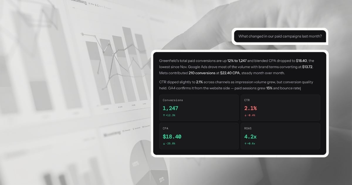
A dashboard shows you that CPA spiked last Thursday. Conversational analytics tells you it spiked 22% to $47.30, driven by a 31% drop in Brand Search conversions after Tuesday's audience expansion—and recommends reverting the targeting change.
That is not a feature difference. It is an architectural one. They are built to answer different questions, and understanding which question your current stack leaves unanswered is the starting point for working out what you actually need.
What a dashboard is built to do
A dashboard is a data visualization tool. It takes structured data from one or more sources and renders it in a consistent, accessible format—charts, tables, KPI tiles, trend lines. The best modern dashboards update automatically, pull from multiple platforms via API connections, and give every person on the team a shared, reliable view of the numbers.
That is genuinely valuable. The ability to look at a single screen and see how paid, organic, and direct traffic are trending—without exporting a spreadsheet—is a meaningful operational improvement over where most teams started.
But a dashboard is defined by what was built into it. It can only show you what someone decided to measure when they configured it. The metrics are fixed. The date ranges are preset. The groupings reflect decisions made weeks or months ago, when the business questions were different.
When something unexpected happens—a CPA spike, an unexplained drop in conversions, a campaign that is outperforming its peers—the dashboard shows you the symptom. It cannot tell you the cause. That part falls to whoever is looking at it.
The manual step that dashboards leave behind
Every agency that uses dashboards for client reporting knows the workflow. You look at the data, form a view on what happened, open a document, and write the explanation. You do that for every client, every month. Industry benchmarks consistently put this at 20 to 60 minutes per client—not for pulling the data, but for writing the narrative that turns data into a communication.
The adoption side is also telling. Research across 73 BI implementations found that 60-80% of dashboards go unused or underutilized, and BARC's multi-year tracking reports only 25% of employees actively use BI and analytics tools. In parallel, SDG Group estimates data preparation alone consumes about 45% of data scientists' time. These are all symptoms of the same issue: teams spend more time preparing, formatting, and translating data than acting on it.
Sources:
- SR Analytics — Business intelligence dashboards
- BARC — BI & analytics adoption strategies
- SDG Group — 2024 data, analytics, AI trends
This is not inefficiency that better dashboard tooling can solve. It is the nature of dashboards. They display. They do not explain. The explanation has always been a human task because the tools were never built to produce it.
Conversational analytics is built to produce it.
What conversational analytics is actually doing
When you type "why did our CPA increase last week?" into LDOO, this is what happens: the platform translates your question into a precise query, runs it against your connected Google Ads data in real time, identifies that Brand Search conversions dropped 31% starting Tuesday while spend held steady, traces the cause to an audience expansion that diluted conversion quality, and writes the explanation—with the specific numbers, the cause, the comparison to the prior week, and a recommendation to revert the targeting change.
That entire sequence takes seconds. The output is not a chart. It is a paragraph your account manager can paste into a client email without editing a word.
The critical distinction is the word interprets. A dashboard renders data. A conversational analytics platform reasons about it. The output is an explanation you can act on, not a visualization you have to read.
Why the comparison table misses the point
Most comparisons between conversational analytics and dashboards focus on features: which platforms connect, whether it supports white-labeling, how fast it updates. These are useful details, but they obscure the more important question: what job is each tool built to do?
A dashboard is built to give ongoing, broadcast visibility into a fixed set of metrics. If you have a client who wants to log in every week and check their numbers, a dashboard serves that job well. It is a transparent window into performance—always on, always current, always the same view.
A conversational analytics platform is built to answer questions you have not thought of yet, about data you cannot predict in advance will matter, in a form that is immediately useful to a non-analyst reader. If you have a client asking why something changed, or a team member who needs to understand campaign performance without building a query, conversational analytics serves that job.
These are different jobs. Framing the comparison as "which is better?" creates a false choice.
The more useful question is: in your current workflow, which job is taking the most time—and is your current stack built for it?
What this costs an agency
For a marketing agency managing 20 clients, the cost of the gap between data and explanation is specific enough to quantify.
Ad-hoc performance questions—the ones that come in via Slack, email, or client calls throughout the month—typically take 15 to 20 minutes each to answer through dashboards and manual analysis. The reporting workflow gap is even wider when you factor in monthly narrative writing. Log into the platform, pull the relevant date range, export or screenshot, write the response. At an average agency billable rate of $150/hour, each question costs roughly $40 in time that could have gone to strategy.
End-of-month reporting—the narrative explanation that turns the dashboard into something a client can read—takes 20 to 60 minutes per client, conservatively. That is $50 to $150 per client, per month, in capacity spent explaining what already happened.
For a 20-client agency, the total is roughly 7 to 20 hours per month—about $1,000 to $3,000 in recovered capacity if the explanation step is compressed. Conversational analytics compresses it. A question answered in seconds instead of 20 minutes. A report generated in 30 seconds instead of 20 to 60 minutes. The recovered hours go back into the work that actually grows client accounts.
Where dashboards still belong
This argument is not that dashboards are obsolete. They serve a real and specific purpose: giving clients and stakeholders ongoing self-serve visibility without requiring them to ask a question every time.
A live view showing revenue trends, ad spend pacing, and traffic by channel is a legitimate and valuable deliverable. It creates a shared reference point. It reduces inbound questions. For clients who want to feel connected to their numbers between reporting cycles, it is the right tool.
The problem is not that dashboards exist. The problem is when dashboards are treated as the full reporting solution—when a client receives a dashboard and is implicitly expected to draw their own conclusions from it. Most clients are not equipped to do that. What they want is an explanation of what the numbers mean and what should happen next.
That is the gap. Conversational analytics fills it.
The architecture question
If you are evaluating whether a tool is genuinely doing conversational analytics or adding a chat layer to an existing dashboard, one question cuts through the noise: is the platform writing a new query for every question, against your actual data, or is it filtering a pre-built view?
A chat interface on a dashboard is still a dashboard. You are asking for metrics it was already configured to show—just differently. The scope of what you can ask is still defined by what was built in advance.
True conversational analytics generates a new query for every question. The scope is your data, not your dashboard configuration. Any question about any metric, any date range, any combination of dimensions—answered in real time from your live connected sources.
That is the architectural distinction that makes the category distinct, and the reason the output can be a client-ready explanation rather than a filtered chart. For a structured framework on what to test during evaluation, see how to evaluate conversational analytics platforms. For a detailed look at how this works technically—the five-step pipeline, the quality gate, the accuracy guardrails—the full breakdown is on how LDOO works.
What this means in practice
The clearest signal that your stack has a gap between data and explanation is the amount of time your team spends writing things down. If the data is available but the communication still requires manual effort, the tool is doing visualization work, not explanation work.
Conversational analytics does not replace the need to think about your clients' performance. It replaces the need to write about it from scratch every time. The thinking stays yours. The writing—and the time it takes—does not have to.
Where the tools sit on this spectrum
The tools agencies actually use fall into clear categories on the dashboard-to-explanation spectrum. Looker Studio, AgencyAnalytics, DashThis, Whatagraph, and Databox are dashboard tools. They visualize data well. They do not explain it. Even a perfectly configured Looker Studio dashboard with every metric segmented and every filter wired requires someone to look at the charts, identify what changed, determine why, and write the summary. The dashboard is the starting point, not the deliverable.
ChatGPT and Claude sit in the middle. They can interpret data if you upload a CSV or paste a table. But they have no live connectors, no multi-client scoping, no awareness of which data source feeds which metric, and no output pipeline. You get a chat message. You cannot turn it into a branded report or a live client portal. Every session starts from scratch because there is no persistent connection to your marketing data.
LDOO is purpose-built for the explanation layer. Live connectors to GA4, Google Ads, Meta Ads, Search Console, and Shopify mean the data is always current. Every answer includes specific numbers, period-over-period comparisons, and causal analysis specific enough to send to a client without editing. From any answer, you can generate a branded report, create a live client portal, or schedule automated delivery. The conversation replaces the interpretation step that dashboards leave to you.
For agencies evaluating tools in this space, the comparison hub includes feature-by-feature breakdowns across AgencyAnalytics, DashThis, Whatagraph, Looker Studio, and others.