Every agency reporting tool starts the same way. A grid. Drag a widget. Pick a metric. Resize, rearrange, repeat. Twenty minutes later you have a layout that looks reasonable but says nothing.
That was LDOO earlier this year. We had a full dashboard builder — drag-and-drop widgets, layout grid, manual metric pickers. It worked. Agencies could build client dashboards and share them via a link.
We deleted all of it.
What dashboards actually do
A dashboard answers the question "what are the numbers?" It shows a grid of metrics, maybe a chart or two, and leaves interpretation entirely to the person looking at it.
That sounds useful until you watch an agency account manager use one. They open the dashboard, scan the numbers, then open a Google Doc and start writing: "Revenue declined 12% last week, primarily driven by a drop in mobile conversions from Meta campaigns..."
The dashboard didn't write that sentence. The account manager did. The dashboard showed data. The account manager explained it.
For a 20-client agency, that explanation step takes 20-60 minutes per client per month. Multiply that across the roster: 400-1,200 minutes a month spent translating numbers into words.
The dashboard isn't the product. The explanation is.
The 20-60 minute gap
We spoke to 10+ agencies before making the decision. The pattern was consistent:
- They pull data from 2-4 platforms (Google Ads, GA4, Meta, Search Console)
- They paste it into a template (Sheets, Slides, or a reporting tool)
- They write a narrative explaining what changed and why
- They format it with client branding
- They send it
Steps 1, 2, 4, and 5 are mechanical. Tools like AgencyAnalytics and DashThis handle them well. Step 3 — the narrative — is where the time goes. No dashboard automates it because no dashboard understands what the numbers mean for this specific client.
That gap is 20-60 minutes of skilled human labour per client per month. It's the most valuable part of the report and the part no tool touches.
What replaced it
A conversation. You ask LDOO a question in plain English:
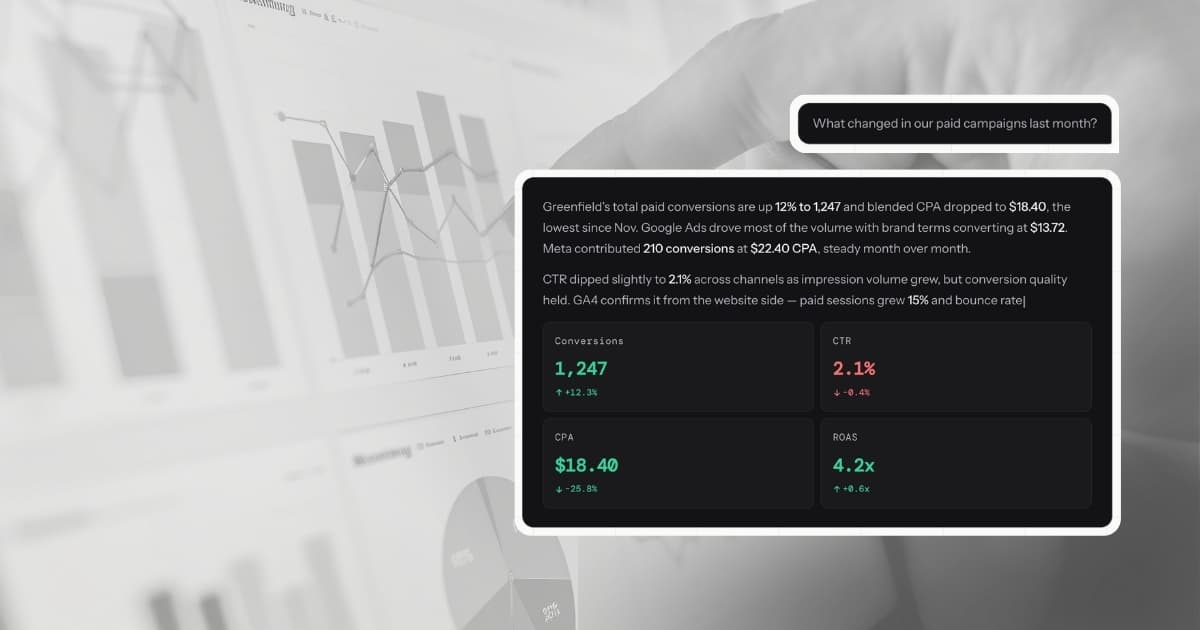
"How did Greenfield Digital perform last month?"
LDOO connects to the client's data sources, runs the query, and returns an answer with specific numbers, comparisons against the prior period, a primary cause for any significant changes, and a recommendation.
Not a chart. Not a table of metrics. An explanation — the same kind the account manager would write, but generated in seconds instead of 20-60 minutes.
The answers are not stateless. LDOO maintains 90-day statistical baselines per metric per client, so it knows what "normal" looks like and flags deviations automatically. When a metric moves significantly, dimensional investigation breaks down the change by campaign, device, region, and channel to find the root cause. Conversation memory carries context forward — the tenth question about a client is sharper than the first.
From that answer, one click generates a branded PDF report. Another click creates a live client portal. The entire workflow that took an hour happens in under two minutes.
Why conversation beats configuration
The dashboard builder had 14 components, a responsive grid system, and a theming engine. We were proud of it. But it had a fundamental problem: it required the user to know what they wanted to see before they saw it.
A conversation doesn't. You ask "what changed this week and why?" and the system decides what's relevant. If CPA spiked 40%, that's the lead. If nothing changed, it says so. The user doesn't need to pre-configure a CPA widget to discover the spike.
This matters more than it sounds. Dashboards are retrospective by design — they show what you decided to track. Conversations are investigative — they surface what matters right now, including things you didn't think to look for.
When a client's bounce rate tripled because a landing page broke, no pre-built dashboard caught it. The first question of the week did.
What we kept
Not everything was thrown out. The data connections, sync engine, and multi-tenant architecture stayed. The query layer that powers live data retrieval stayed. Client branding and white-labelling stayed.
What we removed was the layer between the data and the explanation: the manual assembly step where humans arrange widgets, resize charts, and build layouts that don't say anything on their own.
Client Portal replaced the shared dashboard link. It's a live, branded view of a client's data — but generated from conversation, not configured by hand. The agency creates it by saying "create a portal for Greenfield Digital." No drag-and-drop. No widget picker.
The results
Since removing the dashboard builder:
- Report generation dropped from 20-60 minutes to under 60 seconds
- Every report includes AI-generated narrative and recommendations — the part agencies were writing manually
- Client portals show all connected data sources with per-source KPIs, charts, and sections — no manual layout
- Account managers spend their recovered time on strategy, not formatting
The uncomfortable part
Killing a feature your team built is uncomfortable. The dashboard builder was well-engineered. It had tests, it had users, it solved a real problem.
But it solved the wrong problem. Agencies don't need a better way to arrange metrics on a screen. They need the explanation written for them so they can spend that hour on strategy instead.
Every reporting tool shows you data. LDOO explains it in minutes, not hours. That is a different product.