The reporting tools agencies use have gotten better at one thing: moving data from platforms into templates. API connections are faster than they were three years ago. Scheduling is automated. White-labeling is standard. Most tools now pull from Google Ads, Meta, GA4, and Search Console without anyone touching a CSV.
But the part that actually takes the most time — looking at the data, understanding what happened, and writing the three to five paragraphs that explain it — is exactly the same as it was five years ago. That step is still manual. It still depends on whoever is assigned the client that month. It still takes 20 to 60 minutes per client, every single month.
That is the part that is broken. Not the data pull. Not the template. The explanation.
What reporting tools actually automate
Before getting into what is wrong, it is worth being precise about what is right. The current generation of agency reporting tools solves real problems, and they solve them well.
Data pull. AgencyAnalytics, DashThis, Whatagraph, and Looker Studio all connect to ad platforms, analytics suites, and commerce tools via API. Data flows automatically on a schedule. Nobody exports CSVs anymore — or at least, nobody should be.
Template formatting. You build a report template once, assign it to a client, and the tool populates it with current data each period. Headers, logos, section order, chart types — all configured once and reused.
Scheduled delivery. Reports go out on a cadence. Monday morning, first of the month, whatever the client expects. The tool handles the calendar.
Chart rendering. Line charts, bar charts, KPI tiles, period-over-period comparisons. The visualization layer is competent across all the major tools.
These were genuine problems. Five years ago, agencies spent hours on data extraction alone. That problem is solved. The tools that solved it deserve credit for it.
The issue is that solving data extraction was the easier half of the job.
What they leave manual
Open any report that an agency sends to a client. Skip past the KPI tiles and the charts. Find the section where someone wrote actual sentences — the executive summary, the performance narrative, the recommendations section.
That section was written by a human. Every time. In every tool.
Here is what that process looks like in practice. An account manager opens the report, reviews the numbers, opens the ad platform to cross-reference, identifies that CPA increased 18% because a high-spend campaign shifted budget to a new audience segment that converted poorly, and then writes something like:
"CPA increased 18% this month, driven primarily by the new prospecting audience in Campaign X. While reach expanded by 22%, the conversion rate for this segment was 40% below the account average. We recommend narrowing the audience targeting or reverting to the previous segment while testing smaller prospecting budgets separately."
That paragraph took 10 minutes to write. It required looking at three different views in the ad platform, comparing two time periods, and forming a causal explanation. No reporting tool generated it. No template populated it. No API delivered it.
Multiply that by every section that requires interpretation — the executive summary, the channel-by-channel narrative, the recommendations — and you are looking at 20 to 60 minutes per client per month. For a 20-client agency, that is 7 to 20 hours every month spent writing explanations that sit next to data the tool already collected.
The irony is sharp. The reporting tool automated the 15-minute task (pulling data) and left the 60-minute task (explaining it) entirely untouched.
The cost of the gap
For a typical marketing agency with 15 to 25 clients, the cost of the explanation gap is concrete and measurable.
Time. At 20 to 60 minutes per client per month, a 20-client agency spends 7 to 20 hours monthly on narrative writing. That is roughly one full-time employee's work week, every month, dedicated to writing paragraphs next to charts.
Revenue capacity. At a blended billable rate of $150 per hour, those 7 to 20 hours represent $2,250 to $4,500 per month in capacity that could be spent on strategy, optimization, or taking on additional clients. Over a year, that is $27,000 to $54,000 — enough to fund a new hire or a significant tool investment.
Quality inconsistency. Senior strategists write better narratives than junior account managers. They identify root causes more accurately, frame recommendations more assertively, and calibrate tone for each client. But senior team members cannot write every report for every client. So report quality varies by who is assigned the account that month. The client whose report was written by the Head of Performance gets a different product than the client whose report was written by someone six months into the role.
Scaling ceiling. Agencies hit a wall where adding clients means adding headcount specifically to handle reporting narrative. The data pull scales — one API connection serves indefinitely. The template scales — configure it once. But the explanation does not scale, because it requires a human who understands the data, the client's goals, and what changed this period.
This is why agencies with 20 or more clients consistently rank reporting as one of their top operational bottlenecks. The data infrastructure is solved. The human interpretation layer is the constraint.
Why better dashboards do not fix it
The instinct from most reporting tools has been to solve the explanation gap by adding more visualization options. More chart types. Better drill-downs. Interactive filters. The theory: if the dashboard is good enough, the client can interpret the data themselves, and the agency does not need to write the narrative.
This theory fails for three reasons.
Clients do not interpret dashboards. Most clients open a dashboard, glance at the top-line numbers, and close it. They do not drill into campaign-level data or cross-reference time periods. They want someone to tell them what happened and what to do about it. That is why they hired an agency.
More charts increase complexity without reducing writing time. A dashboard with 30 widgets gives the account manager more to look at before writing the summary, not less. The writing step takes the same amount of time — or longer, because there is more data to reconcile.
Dashboards are visualization tools being asked to do communication work. A chart shows that CPA went up. It does not say why CPA went up, whether it matters, or what to do about it. The gap between showing data and explaining data is not a feature request. It is an architectural limitation. Dashboards render metrics. They were never designed to produce explanations. For a deeper look at this distinction, see conversational analytics vs dashboards.
This is not a criticism of dashboard tools. They are excellent at what they were built to do. But they were built to display data, and the problem agencies face is explaining it. Better displays do not produce better explanations. They are solving a different problem.
What actually fixes it
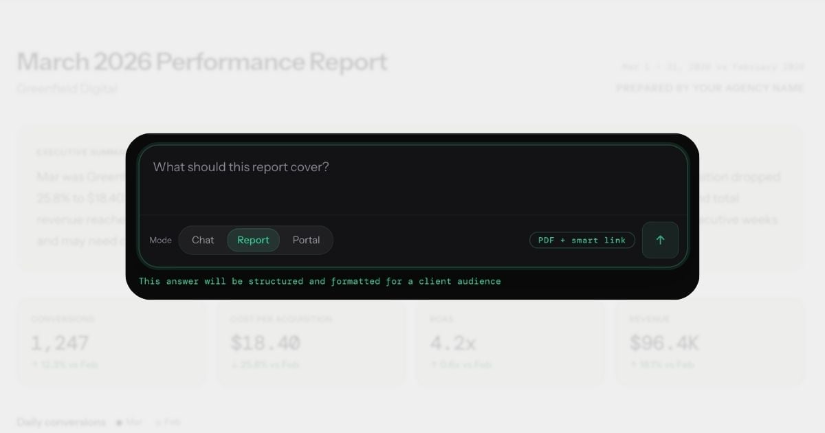
The explanation gap closes when the tool itself produces the explanation — not just the visualization. When you can ask "Why did CPA increase this month?" and get back a specific answer with the actual numbers, the actual cause, and a recommendation grounded in the data.
This is what conversational analytics does. Instead of opening a dashboard and manually interpreting what you see, you ask a question in plain English and get back the paragraph that would have taken you 10 minutes to write. The explanation includes specific numbers, a primary cause, a comparison to the prior period, and an actionable next step.
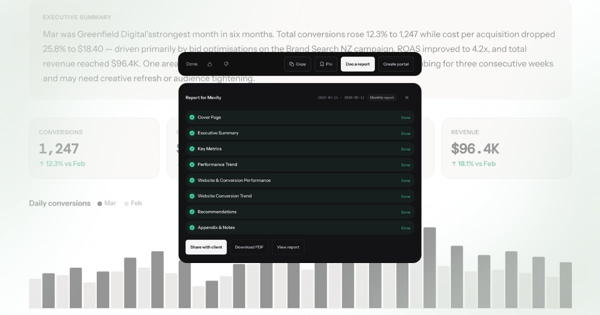
From that answer, you generate a branded report. The narrative sections — the executive summary, the channel breakdowns, the recommendations — are written by the system, not by the account manager.
The system is not guessing. Each answer draws on 90-day statistical baselines per metric, so "CPA increased 18%" is contextualized as "18% above normal" or "within typical weekly variance." Dimensional investigation automatically breaks down significant changes by campaign, device, region, and channel. Conversation memory means the report narrative can reference what changed since the last report. Custom alert rules — set in conversation, not a settings page — flag problems before the client notices. The report uses the agency's branding, includes the data the client expects, and arrives formatted for PDF export or smart link sharing.
The workflow changes from "collect data, then write about it" to "ask about it, then send the answer." The writing step — the broken part — is replaced by a question.
For a deeper look at how this changes the client reporting workflow specifically, see what conversational analytics means for client reporting. For guidance on evaluating tools in this category, see how to evaluate conversational analytics platforms.
Before and after
Same client. Same month-end reporting cycle. Same deliverable: a branded performance report with executive summary, KPI overview, channel breakdown, and recommendations.
Before: traditional reporting workflow
- Open Google Ads. Review campaign performance. Note that CPA increased 18% and identify the prospecting campaign as the driver. (8 minutes)
- Open GA4. Check landing page conversion rates to confirm whether the traffic quality declined or the funnel broke. (6 minutes)
- Open Meta Ads Manager. Compare Meta performance to Google to determine if the CPA increase is platform-specific or account-wide. (5 minutes)
- Open the reporting tool. Confirm the template is pulling current data. Adjust date range. (3 minutes)
- Write the executive summary. Two paragraphs explaining what happened, why, and what the agency recommends. (12 minutes)
- Write channel-by-channel narratives. Google Ads, Meta, organic — each needs 2 to 3 sentences of context. (15 minutes)
- Write the recommendations section. Three prioritized actions with rationale. (10 minutes)
- Review formatting, check for errors, export PDF. (6 minutes)
Total: 65 minutes. Of which approximately 20-60 minutes was interpretation and writing.
After: conversational analytics workflow
- Ask: "How did this client perform last month? What changed and why?" Review the answer — it identifies the CPA increase, attributes it to the prospecting campaign, notes stable Meta performance, and recommends narrowing the audience. (1 minute)
- Click "Doo a report." The system generates a branded report with executive summary, KPIs, channel breakdown, and recommendations — all populated from the answer and the underlying data. Review, adjust if needed. (1 minute)
- Send via smart link or export PDF. (30 seconds)
Total: under 3 minutes. The explanation — the part that took 20-60 minutes — wrote itself.
The data is the same. The report looks the same. The client receives the same deliverable. The difference is that no one spent 20-60 minutes writing it.
What this means for agencies
When the explanation step goes from 20-60 minutes to zero, the downstream effects compound.
Reporting stops being a bottleneck. Month-end does not mean a week of report writing. The team's calendar opens up for the work that actually grows client accounts — strategy, creative, optimization.
Junior team members produce senior-quality output. The explanation quality no longer depends on who is assigned the client. A team member in their first year produces the same caliber of narrative as the Head of Performance, because the system writes it from the same data with the same analytical rigor. The quality floor rises to match the quality ceiling.
The agency can scale without scaling headcount proportionally. Adding five clients no longer means hiring someone to handle the reporting load. The data pull was already automated. Now the explanation is too. The constraint shifts from "how many reports can we write per month" to "how many clients can we serve strategically" — a much better constraint to have.
Client communication improves. When generating a report takes 2 minutes instead of 65, agencies send reports more frequently. Weekly instead of monthly. After every significant change instead of on a fixed schedule. Clients stay informed, and the agency demonstrates value continuously rather than in periodic snapshots.
The team focuses on what they were hired to do. Agencies are hired for their strategic judgment, not their ability to write paragraphs next to charts. When the paragraph writes itself, the team spends its time on the judgment that produced the paragraph — the interpretation, the recommendation, the strategic direction. That is where agencies create value. Reporting was always the vehicle, never the destination.
The reporting tool you actually need
The reporting tools agencies adopted over the past five years solved the data problem. APIs, templates, scheduling, white-labeling — all solved. Those tools earned their place in the stack.
But the explanation problem — the 20 to 60 minutes of interpretation and writing per client per month — remained untouched. Not because the tools were bad, but because they were built to visualize data, not explain it. Dashboards show metrics. They do not tell you why CPA spiked, whether it matters, or what to do about it.
The next generation of reporting is not a better dashboard. It is a tool that produces the explanation. You ask a question. You get a specific, client-ready answer. You generate a branded report from that answer. The manual writing step — the part that was broken — is gone.
That is not an incremental improvement to the existing workflow. It is a different workflow entirely.
The search terms tell the story
Agencies search for "automated client reporting," "AI report generation," and "reporting automation software" — all trying to solve the same problem from different angles. The keyword pattern reveals what is broken: people know reporting should be automated, but the tools they find automate the wrong layer.
AgencyAnalytics, DashThis, and Whatagraph automate the data pull. Looker Studio automates the visualization. None of them automate the explanation — the 20-60 minutes of narrative writing that makes a report useful to a client. The data shows up in a dashboard, and then someone still has to write "CPA increased 18% because Brand Search spend shifted to Generic terms after the budget reallocation on March 3rd." That sentence is the report. The chart is just evidence.
That is why "AI client reporting" is emerging as a search term. Agencies are not looking for better dashboards anymore. They are looking for a tool that writes the report — the actual explanation, not just the charts. Conversational analytics is the category that delivers this: ask a question, get an explanation, turn it into a branded report.